This groundbreaking class will reveal the rules of the masters in producing convincing realism in your
paintings. In fact, you will learn that realism does not have to be painstakingly tedious to be
successful. While photorealism can at times depend on the most meticulous of details to
communicate its idea, traditional realism separates itself by looking for that gray area in painting that
says more with less. This highly investigative yet inviting course will re-open the doors of the past,
ignite the imagination and stoke the fine artist within. Also, Steve Gibson will introduce traditional oil
painting methods and how you can incorporate them into your airbrush work. These methods,
reapropriated for use with an airbrush have been developed off and on over the past decade-they
are meant to reveal a more universal process of building an image regardless of subject matter. The
purpose of this instruction is to provide you with the tools necessary to develop your own vision
while following a methodical approach that also allows for individual interpretation of both subject
matter and its meaning.
This class is comprised of a culmination of intense practice, an ever insatiable thirst for artistic
knowledge of traditional and academic painters from the past, and thru years of trial and error,
an effort to find relevance and practical application methods for the airbrush using the what
has been learned regardless of surface or substrate.
This class is NOT another gimmick that has been slapped together recently to sell you a trend
in airbrush painting... it is genuine. Its foundations have been earned in practice and in patience-
over years. You will begin to learn how to paint and see as an artist in a traditional sense and make
aesthetic decisions based on long established principles in the visual arts. You will not just
copy and match an image- I will ask you to go further and beyond...
In this course you will learn:
•What makes good subject matter; nature vs. the photograph.
•How airbrush painting a grisaille (monochromatic grey) will give you better control
over establishing value and its many nuances.
•Starting from a mid-tone and working toward light and dark through a systematic
“push-and-pull” approach.
•Separating color and value during the painting process and its advantages.
•Transparent versus opaque techniques and when to use them.
•Painting through mistakes with ease and confidence.
•The importance of form over detail; working large to small.
•How to make aesthetic decisions based on traditional principles.
•Freehand techniques with little or no masking aids.
•The versatility of an all “additive” painting process.
Who is this class for...?
Airbrush Realism is open to the novice to seasoned professional. A basic to intermediate
understanding of the airbrush is recommended and preferred. This class uses academic and
traditional painting methods repurposed for a modern approach specific to airbrush. The tried and
true results of these ideas hang in the most prestigious galleries and institutions world-wide and
were developed by master painters and draftsman dating back over half a millennia!
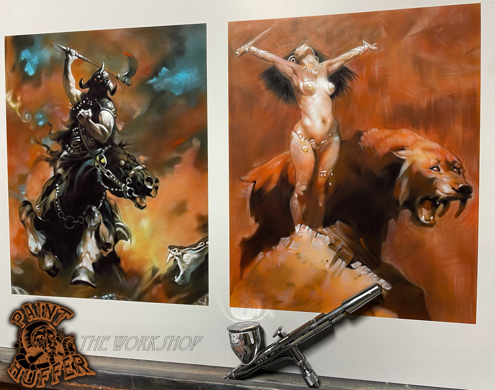
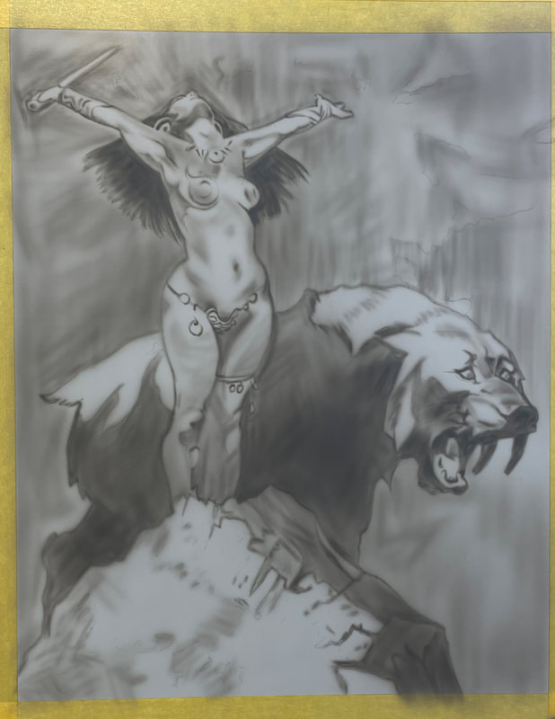
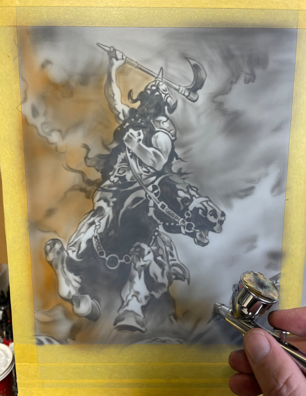
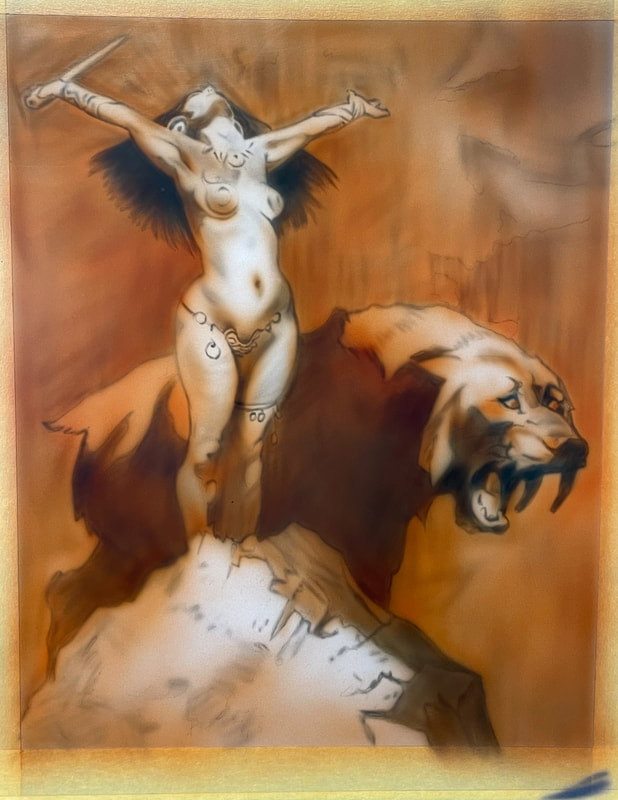
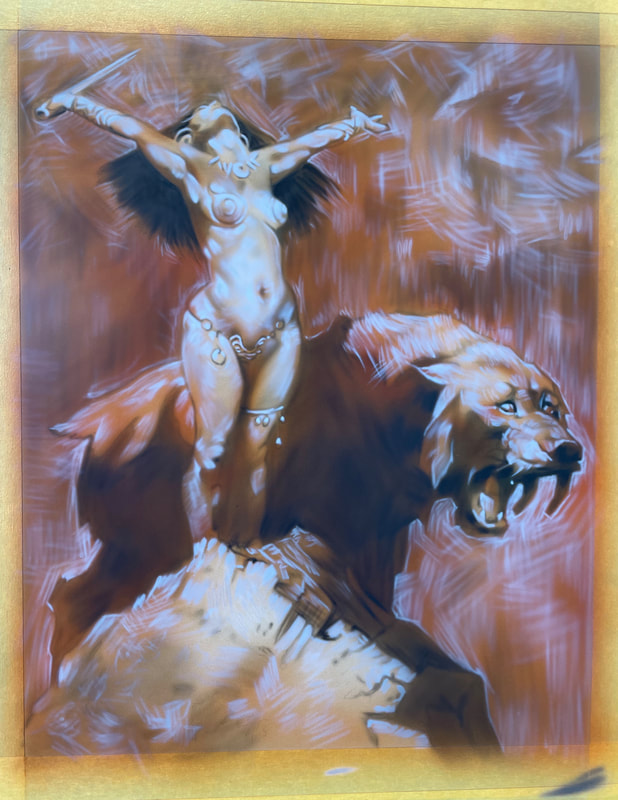
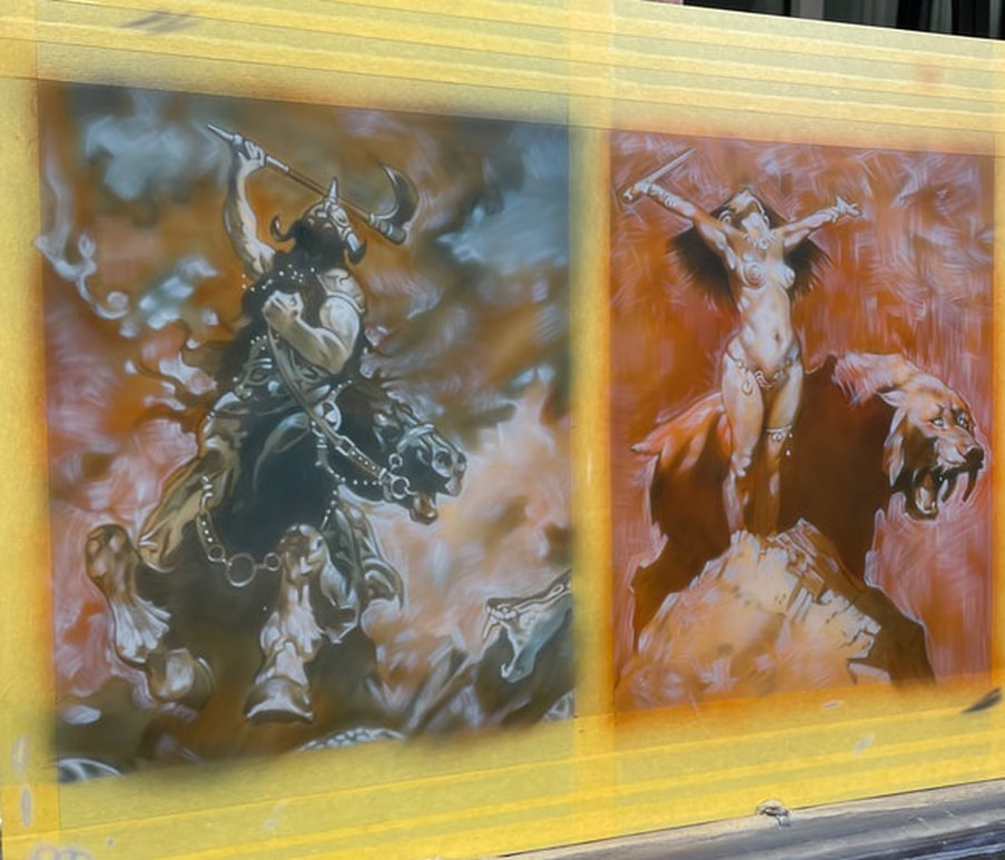
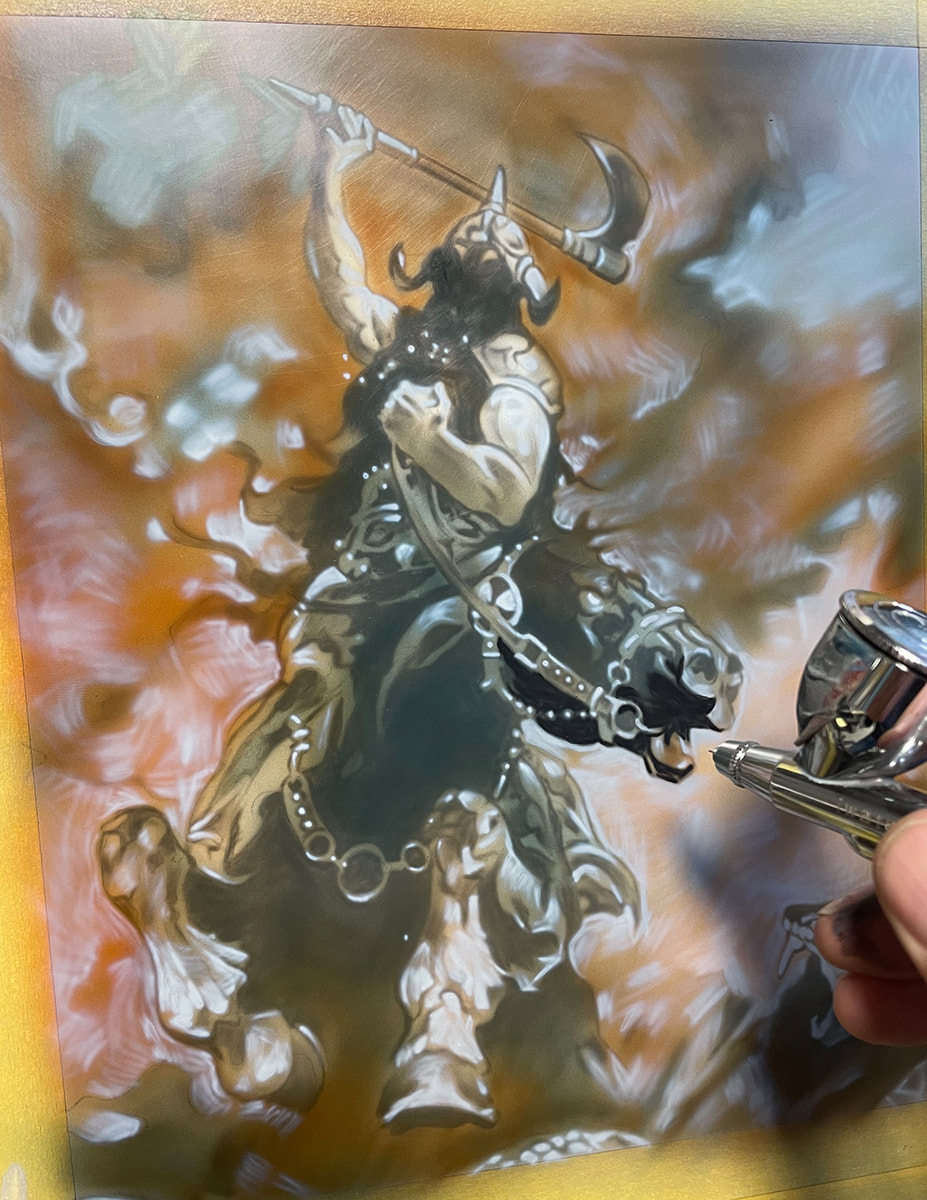
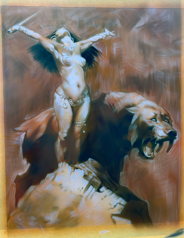
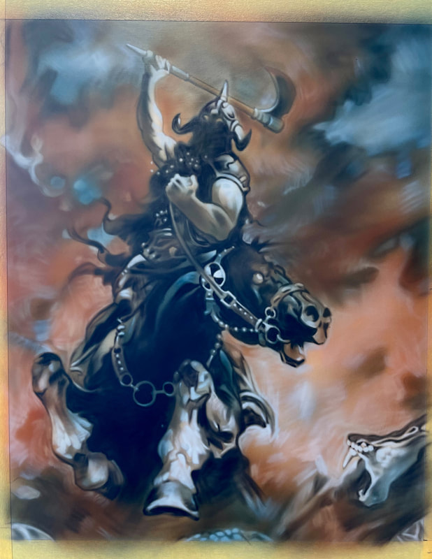
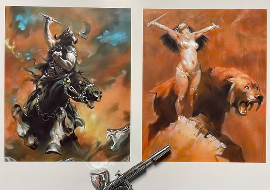
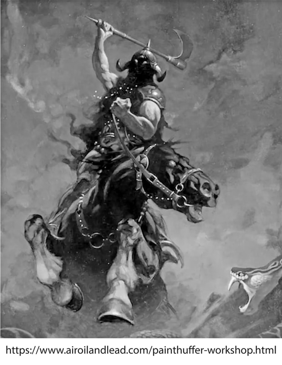
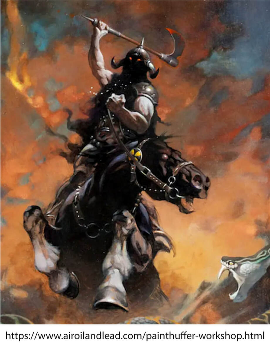
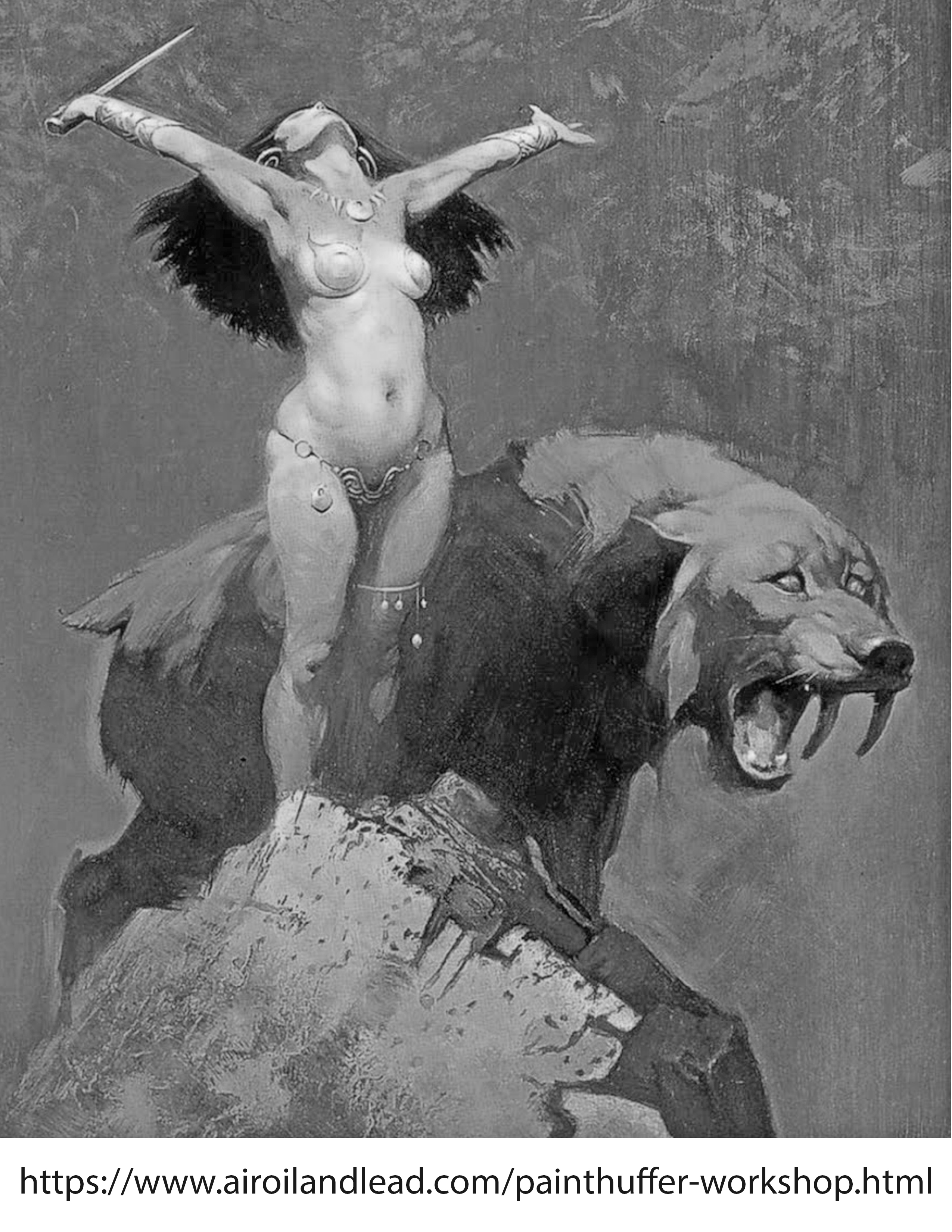
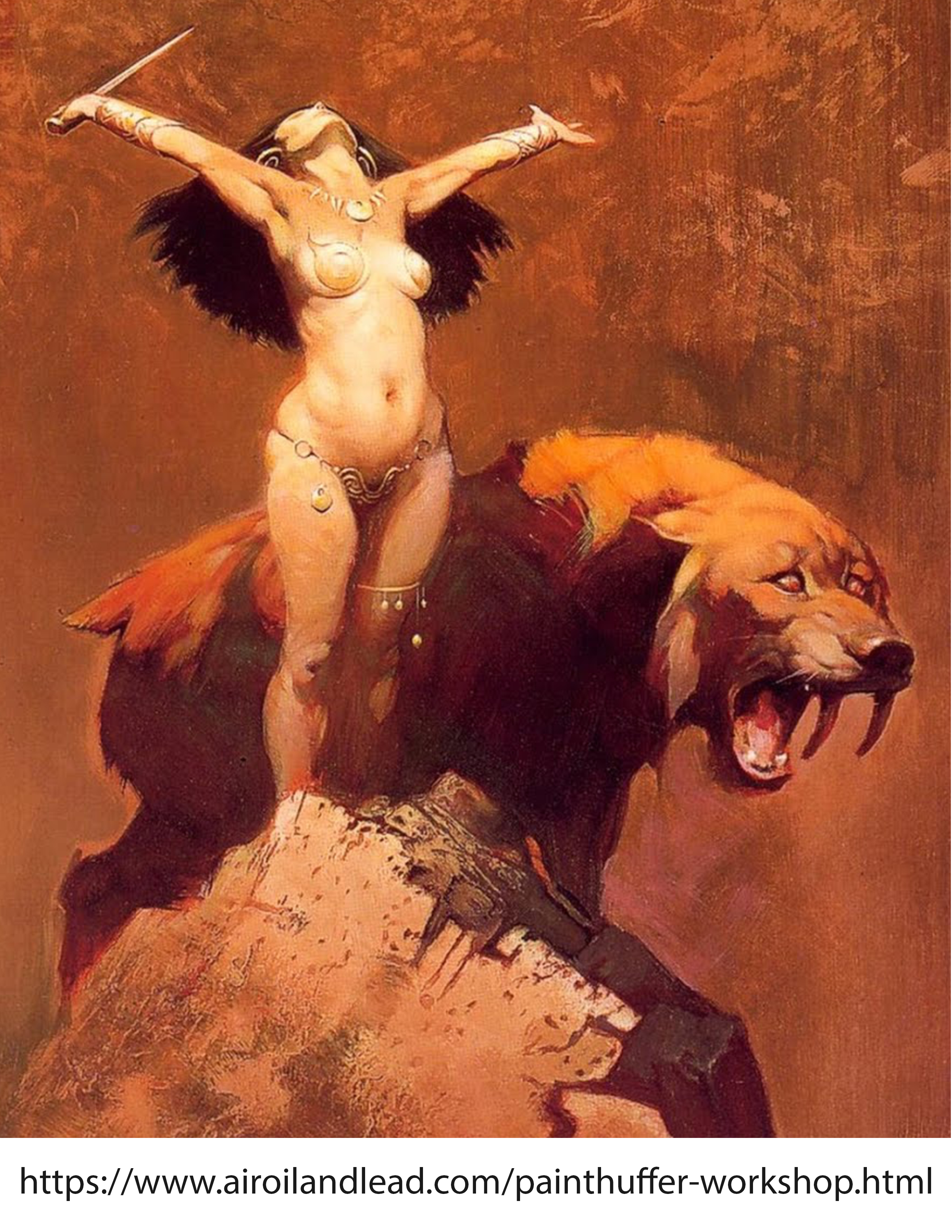
Step by step-class projects/ paintings based on
Frank Frazetta's paintings (Death Dealer 6, 1990) and (Sun Goddess 1970)
Frank Frazetta's paintings (Death Dealer 6, 1990) and (Sun Goddess 1970)
|
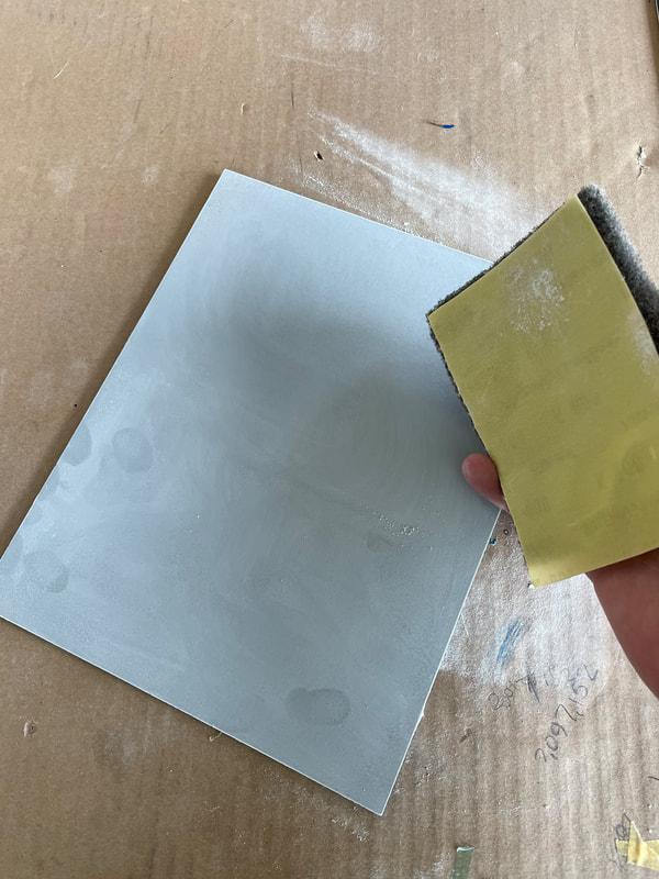
1. The panel was prepped with House of Kolor KD 3001 and KD 3000 to surface sealed 4:1 mixing ratio, sealer to catalyst. The panel was then lightly scuffed with super Assilex 800 yellow sandpaper made by Kovax. Then lightly sanded again with a gray Scotch-Brite pad (my preference, definitely not a necessary step for good paint adhesion.)
|
|
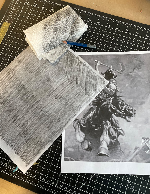
2. I transfer my image by backing it with a 4B graphite pencil (#2 will suffice) that is then rubbed with a paper towel for an even backing.
|
|
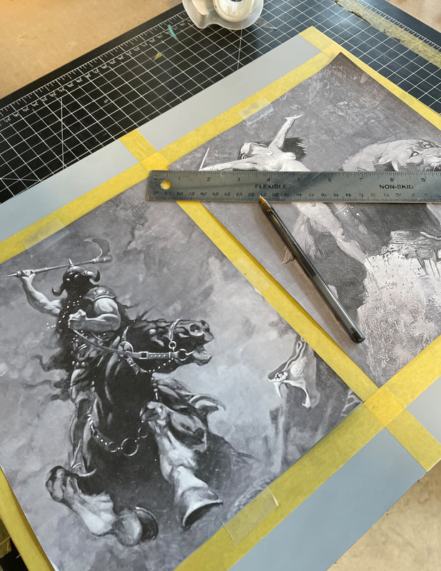
3. I then tape my image into place using regular green scotch tape. In this case I space the images using a center point working from the center outward.
|
|
|
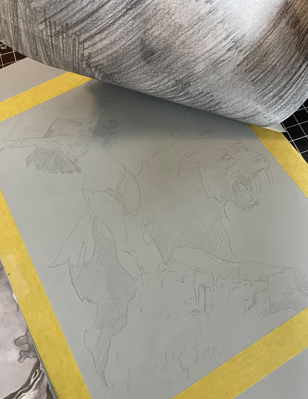
4. I use both a ball point pen and soft graphite pencil to transfer my image. I use the pen for my harder lines and I use the softer pencil to block in larger darker areas. This transfers the graphite in different densities onto our working surface.
|
|
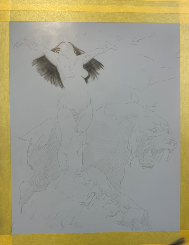
5. Carefully lift off your transfer copy revealing the drawing the beneath it. Make sure you don’t pull it off in its entirety in case you missed a few spots and need to reposition it exactly where you had it before. I generally leave two pieces of tape in place until I know I am happy with my transfer. What the transfer will reveal looks more like a polished drawing than a series of lines. I find this helps speed up the pace of my initial passes. Coverage isn't a factor as we are painting with opaque paint.
|
|
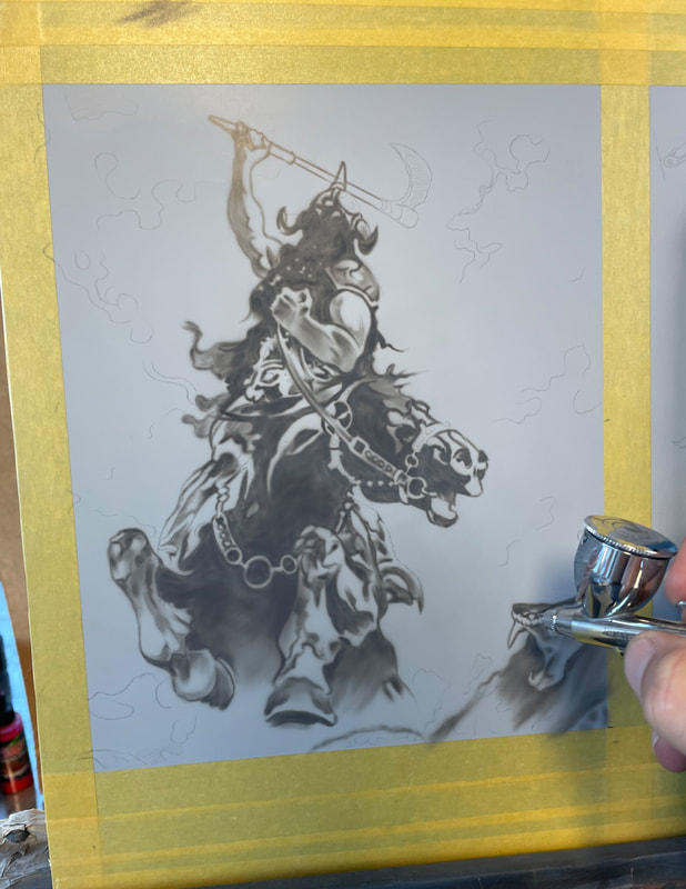
6. On my number five gray surface, I begin laying in my darker tones with #3 grey. For this exercise I’m using House of Kolor #3 at about a one to one ratio spraying at 60 PSI. I don't always marry myself to a specific PSI, but I am resigned to the fact that I spray at a higher pressure than most airbrush practitioners. This includes the majority of details also.
|
|
11. Time for color! Normally for color and this approach I layer Createx illustration colors on top of my House of Kolor opaque grey color. As long as the paint is dry the colors will mesh. Here I start by laying a burnt Sienna into the background in accordance with the reference image. I am still spraying upwards of 50 psi, with a reduction of about 60%reducer to 40% paint. Slightly less than 1 to 1. I don’t abide by a specific ratio when it comes to reducing my paint as the image usually dictates how quickly I will build up my color or how subtle. Individuals may find different reduction more applicable during the color passes of this project.
|
|
12. Using a mix of predominantly burnt sienna, I add a touch of cobalt blue. I start "deliberately" not hazing in my gold hue color. I make sure that I saturate my gray area to its fullest capacity before I move on.
|
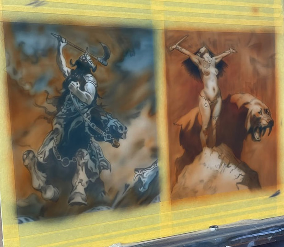
13. Continuing on to the next color(s) I analyze where and what my color is on my painting versus what it looks like on my reference image. I like the illustration orange and yellow to continue to warm up the skin tones as well as the tiger . After implementation, I observe that the colors need to shift to the cooler side again, so I switch back to cobalt blue to cool off some of my mid-tones and marry the warm and cool tones together a bit more. This will ensure that there is a real synergy with my palette. I usually start sparingly and I am a little more generous with my color as I gain confidence that my color choice seems to be correct and taking me in the direction I want to go. Sometimes "where" I want to go is not the direction the picture is going...this is where creative decisions are made that will allow you to deviate from your reference in favor of something that may be more unique to your own vision of palette.
|
14. After my first round of color, I go back in and re-investigate some of my midtone highlights and other details. Depending on the amount of time I have to work with I may go back to my number five gray to redefine some of those areas, or if I need to move quicker I may choose to go a little bit lighter with a number seven gray, with a bit lighter Touch in some of those areas, while enhancing some of my lighter values during the same step. Because of time constraints, I elected to go with the ladder for this painting. I went with a number seven, with a little bit more reduction essentially skipping a step to move the project along any more rapid pace. While I find from time to time that this kind of move takes away from aesthetic of the highest quality, I also remember the difference between a commercial endeavor and a fine art endeavor. As defined to me, fine art is of the highest art form, while a commercial endeavor essentially does serve a purpose with a deadline and a budget in mind. That is the beauty of this approach, it allowsFor that kind of thinking during the process as a pertains to the motive behind the image making.
|
15. For my final pass, at least for this piece, I mix up a combination of illustration colors. I believe cobalt blue, Violet, and a touch of illustration black. This gives me an extremely rich and dark color versus a dead neutral value that just plain black will give you. Like mentioned earlier, Time permitting, I may go back and forth several times reestablishing some of my lighter tones in gray and re-glazing my transparent color on top. The more that color builds up the more depth Will be achieved in the more synergy and marriage between colors and color combinations.
|
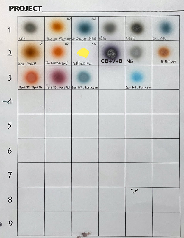
16. Something I have been doing in the last year is keeping color charts as I move through painting chronologically from left to right much like a book. Just a quick color notation as I move forward that way if I need to backtrack and see what was used and where I used it, it is much easier to trace. Much like a color journal per piece of artwork.
|
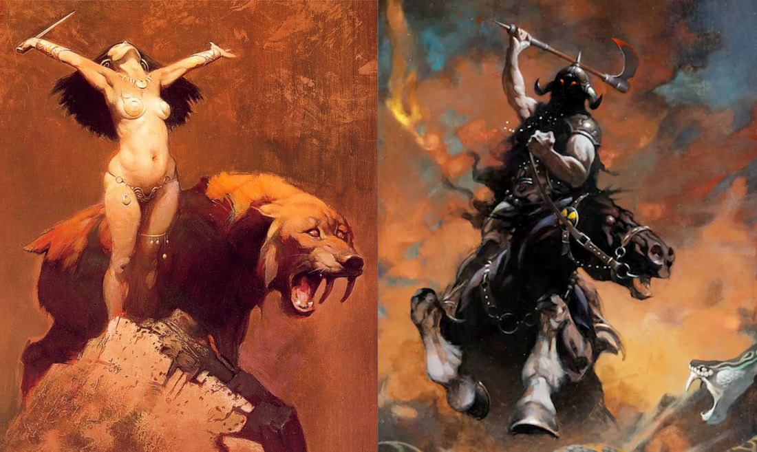
Frazetta paintings and references


Digital Downloads/ reference photos
|
|
|
| ||||||||